


I signed up for a year of citizenM membership before I’d even made my first booking.
That’s how good it looked. The co-working deal, the hotel vibe, the app—it all screamed incredible value. Everything had this playful, easy-to-use feel that made me want in immediately.
Late October, I’m in London for three days servicing three clients. I open the app, book my room. Because I’m a member, I get 15% off automatically. The app asks if I want an upgraded view. Sure. I get the Tower of London—for free. The whole thing takes 90 seconds.
I’m working from my room, from the co-working space downstairs, having genuine conversations with the citizenM staff. Their brand value says it perfectly: “Genuine Touch: I connect with guests, colleagues and partners as friends. My actions are sincere, not scripted.”

I told the staff I hoped things stayed the same after the Marriott acquisition. They nodded knowingly. “A few other guests have said the same thing.”
One month later, I’m back. I open the app to book my room. It forwards me out to the Marriott website.
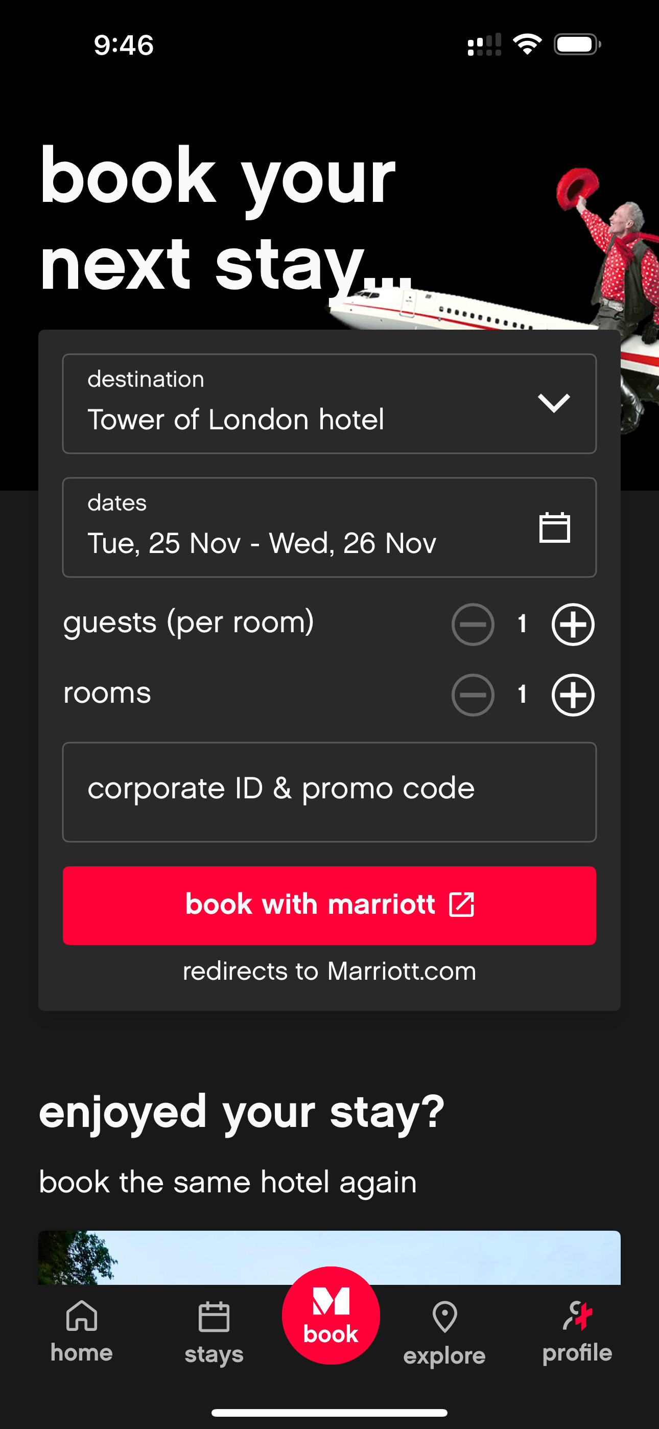
The seamless experience I’d just paid a year’s membership for? Gone. The app that let me book, get my member discount, choose my upgrade, and control my room—all in one flow? Split in half.
This is how great UX dies.
What Casper Overbeek Built
Casper Overbeek is citizenM’s Chief Product Officer. Before that, he was their Chief Customer Experience and Chief Digital Officer. His job was connecting a successful front-end guest experience to a back-end that avoided legacy complexity.
Here’s what his team created:
One unbroken journey: Book your room in the app → member discount applied automatically → select your view or upgrade → check in → use your phone as your room key → control your lights, blinds, heating from the same app → manage your stay → rebook your next visit. No switching platforms. No logging into different systems. One flow.
Membership that actually works: The 15% discount wasn’t a promo code you had to remember. The free upgrade wasn’t a request form you had to fill out. It just happened, in the booking flow, because the system knew who you were and what you’d earned. That’s what seamless means—rewards without friction.
The contextual card: A dashboard in the app showing “your next best action” based on where you are in your stay. Not a menu dump. Not feature overload. Just what you need, when you need it.
The playful UX: Every interaction had personality. Opening your blinds wasn’t a boring slider—it had character, visual feedback, a sense of delight. The app felt like the brand.
The architecture underneath: They rebuilt their entire digital ecosystem—mobile app, website, in-room controls, check-in kiosks—with one goal: frictionless experience across all touchpoints. They replaced about 20 backend services and moved to an API-first platform specifically to maintain this seamless flow.
The result? Higher NPS scores. More complete user profiles. Higher customer lifetime value. Staff could focus on genuine interactions instead of solving system problems. And members like me got a Tower of London view without asking.
What Marriott Broke
April 2025: Marriott announces citizenM acquisition.
July 2025: Deal completes.
November 2025: The app redirects booking to Marriott.com.
The journey is now: Open citizenM app → get pushed to Marriott website → book there → switch back to citizenM app → use your phone as key → control your room.
They broke the flow.
You might think: “So what? It’s just one extra step.” But that extra step violates the fundamental UX principle that made citizenM special: Don’t make your user switch platforms mid-journey.
When you force someone to leave your ecosystem, you’re not just adding friction. You’re breaking trust. You’re saying “we built this incredible experience, but actually, use this other company’s website for the most important part.”
It’s like Apple telling you to buy your iPhone on Amazon’s website, then come back to the Apple app to use it.
Why This Happens (And How to Avoid It)
Platform integrations kill great UX because the acquiring company optimizes for their existing systems, not the acquired product’s unique flows.
Marriott has hundreds of hotels. They have one booking system. citizenM has to fit into that system. The easiest technical solution? Redirect booking to Marriott.com.
The problem: Easy for the company doesn’t mean good for the user.
Here’s what Casper’s team understood that gets lost in acquisitions:
1. Map the entire journey, not just features
citizenM didn’t design an app with booking and room controls. They designed a journey from “I need a place to stay” to “I want to come back.” Every touchpoint reinforced that journey. When you remove one touchpoint, the whole journey breaks.
2. The magic moments are where users transition between contexts
Going from “researching hotels” to “I’m staying here” to “I’m controlling my space” should feel like one smooth motion. The moment you eject someone to a different platform, you’ve created a mental speed bump. They have to re-orient. They lose momentum.
3. Your UX is your moat—protect it during integrations
Casper spent years building this experience. It drove membership signups before first bookings. It created loyalty. When the integration plan prioritized technical efficiency over preserving that experience, they eroded their competitive advantage.
What You Should Do
If you’re working on a product that might integrate with another platform, or you’re the acquiring company, here’s your checklist:
Before integration, audit the user journey for platform switches
Walk through every user flow. Mark where users have to leave your ecosystem or switch apps. These are your vulnerability points.
Ask: “What made users choose this product?”
If the answer involves seamless experience or unique flow, that’s what you’re risking. In citizenM’s case, users chose it because everything was in one place. Breaking that broke the value proposition.
Design the integration to preserve continuity
Sometimes you can’t avoid platform switches. But you can design around them. Could the booking stay in the citizenM app but use Marriott’s backend invisibly? Could you at least keep users in the same visual experience?
Test with real users before rollout
If other guests were telling citizenM staff “I hope things don’t change,” that should have been a signal. User feedback during beta testing would have caught this.
Monitor the metrics that matter
After integration, watch: booking conversion rates, session duration, NPS scores, churn. If users are dropping off at the platform switch, you know what broke.
The citizenM app was proof that when you align brand, UX, and architecture around one unbroken user journey, people notice. People pay for it. People tell hotel staff they hope it stays the same.
One month later, it didn’t.
Republished in Design Week


No Comments.